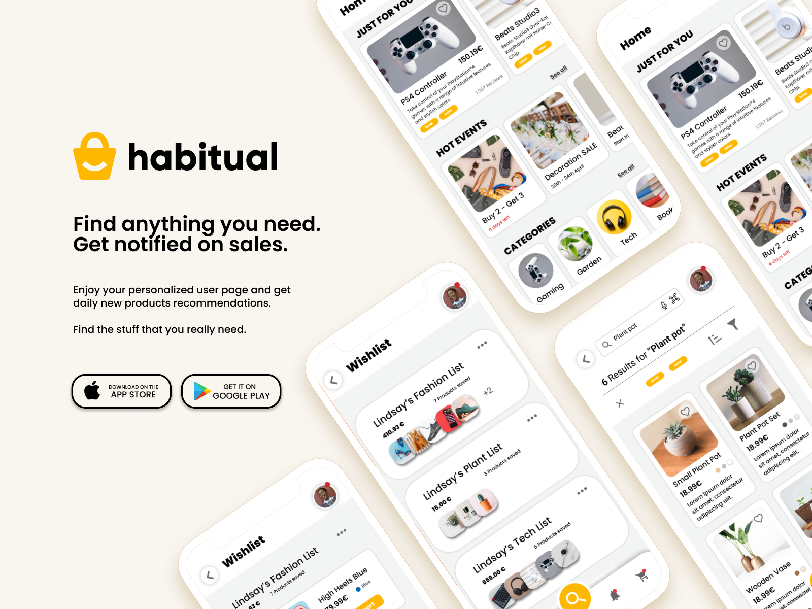
habitual - App
| My role: | UX designer, UI designer |
| Date: | August 2022 - November 2022 |
| Tools: | Figma, Miro |
Project Overview
This case study is the result of a challenge given by the instructors of the Udemy course Complete Web & Mobile Designer in 2023: UI/UX, Figma, +more which I have participated in august 2022.
The fictional client
wanted a mobile app that is able to compete with the e-commerce plattform Amazon. The name and logo was already given by the client.
User research / Collecting data
Research on Amazons success
What are good and bad features of Amazon’s UX/UI?
Why is Amazon successful?
Which UX/UI has been proven to work and be kept? What should be improved on?
These were the questions I focused on in my research.
- In-depth search/filter function
- Rating and review system
- Wide range of products and prices
- Personalized home page based on search function
- Text and image-based cues
- Short delivery / free shipping
Pros
- Old-fashioned UI
- Too many ads
- Feature overload on webpage
- Content overload on homepage
- Long scroll-time to reach reviews
Cons
Issues
Amazon is overloaded and very distracting. There is too much going on on almost every page and can feel quite chaotic when opening Amazon for the first time. The user is overwhelmed and often learns to blank out all the unnecessary information.
Goal
Creating an app that keeps the features that already have proven to be successful/functional. Creating a modern UI system and keeping the content neat and simple to provide a more intuitive user experience.
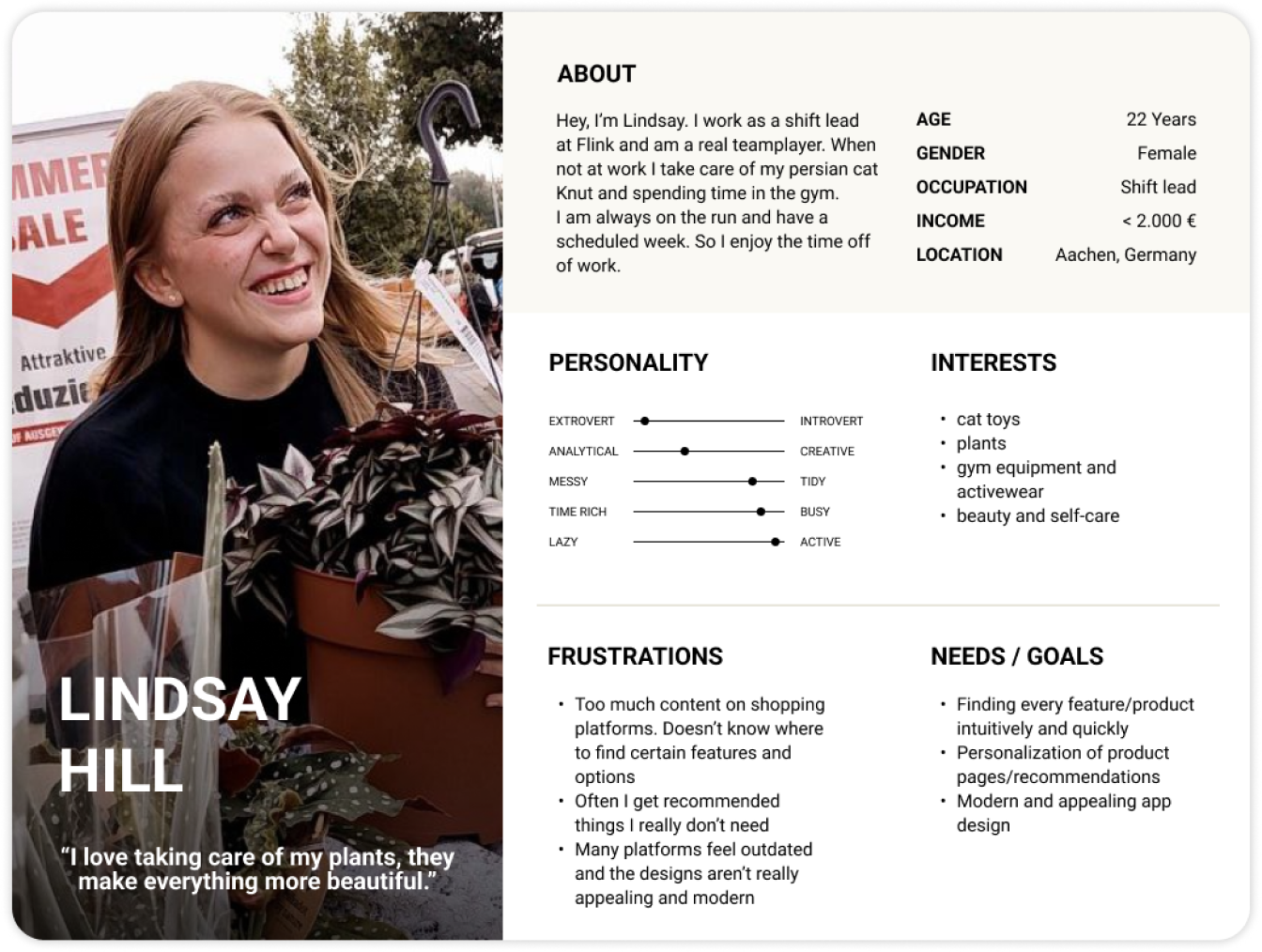
User Persona
Based on my user research I created two user personas which represent the younger target group and their needs and goals. This helped me to make to user more tangible and give it a more personal feeling when discussing the users needs and painpoints. I will use their names in this case study.
User Journey
I also created a user journey map to see how the user moves through the app to find a certain product. This map captures the users actions, thoughts and feelings. This helps breaking down the users way towards the goal and where painpoints lie. This map shows the users search for a product on Amazon, starting from the homepage to placing the order.
Special painpoints were an unappealing UI, pricy products and too many distractions which the user encounters regularly. These are the main painpoints which I want to improve and implement in the Habitual app.
Ideation
How might we - questions
I tried to turn these painpoints into compact ‘How Might We’ questions that find the sweet spot between too general and too detailed and leave enough room for creative solution findings. I decided to focus on the following:
- HMW - personalize a users home page?
- HMW - personalize a users wishlist?
- HMW - personalize a users checkout?
- HMW - reduce distracting content on the app?
- HMW - make searching for products more efficient?
- HMW - provide cheap products?
Brainstorming ideas
I used my research and my own ideas to find solutions for these HMW questions. I collected everything that came to my mind in a diagram and later decided on the most appealing ones to further ideate.
Design
User Flows (Storyboard)
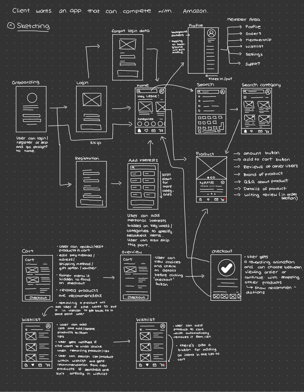
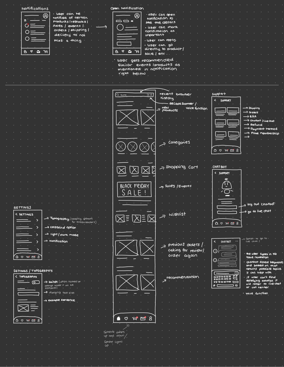
I started with drawing simple user flows to visualize the users steps to accomplish a goal namely finding the right product and placing an order. I drew everything that came to my mind and looking for other solutions that might help eliminating pain points.
I turned these sketched-out user flows into more structured maps in Miro.
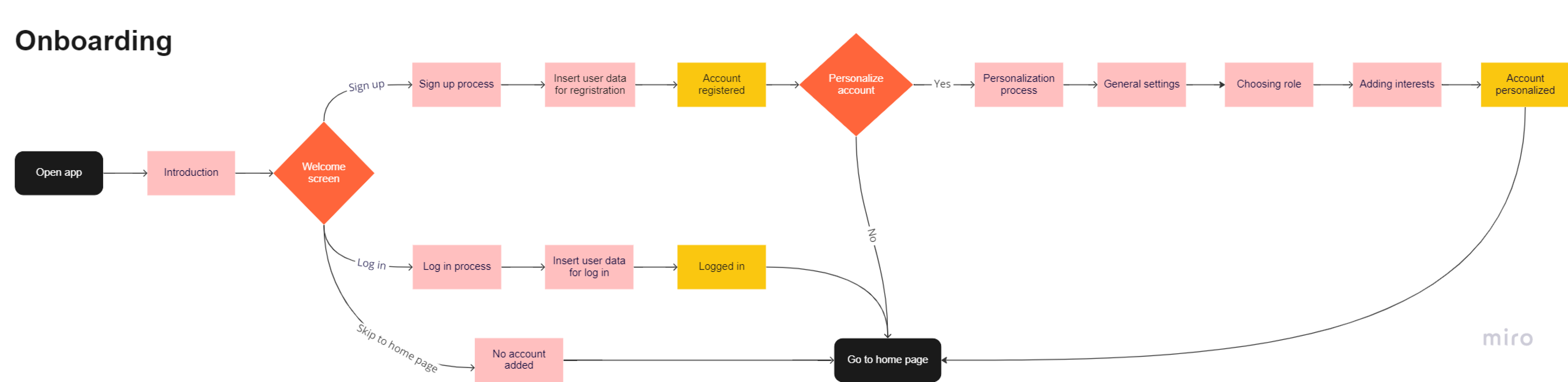
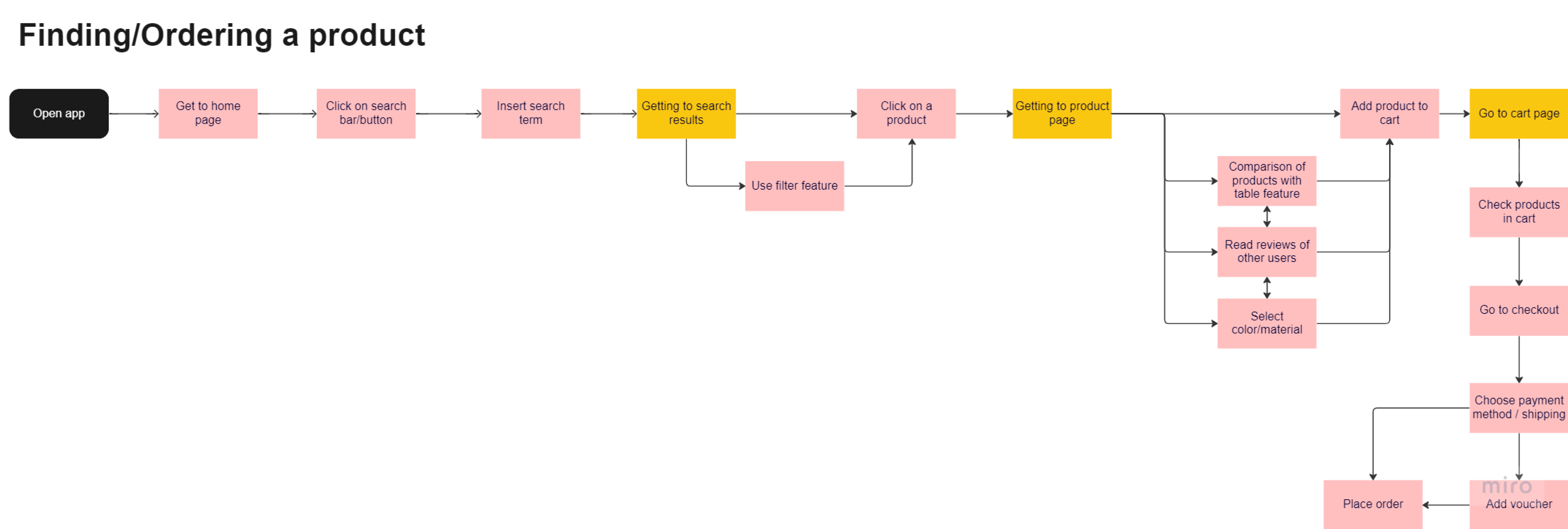
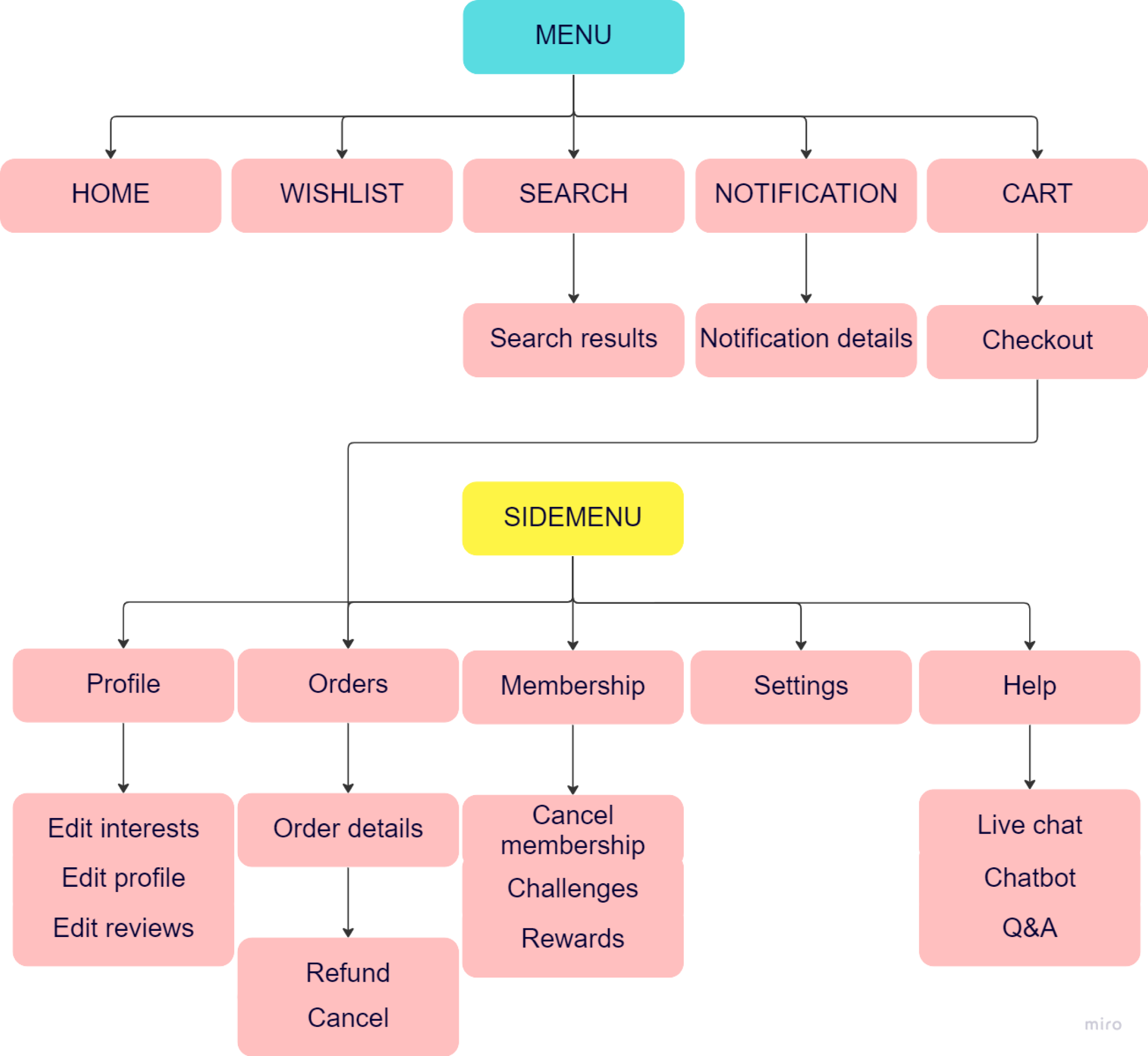
I created a sitemap to help guide my user flows.
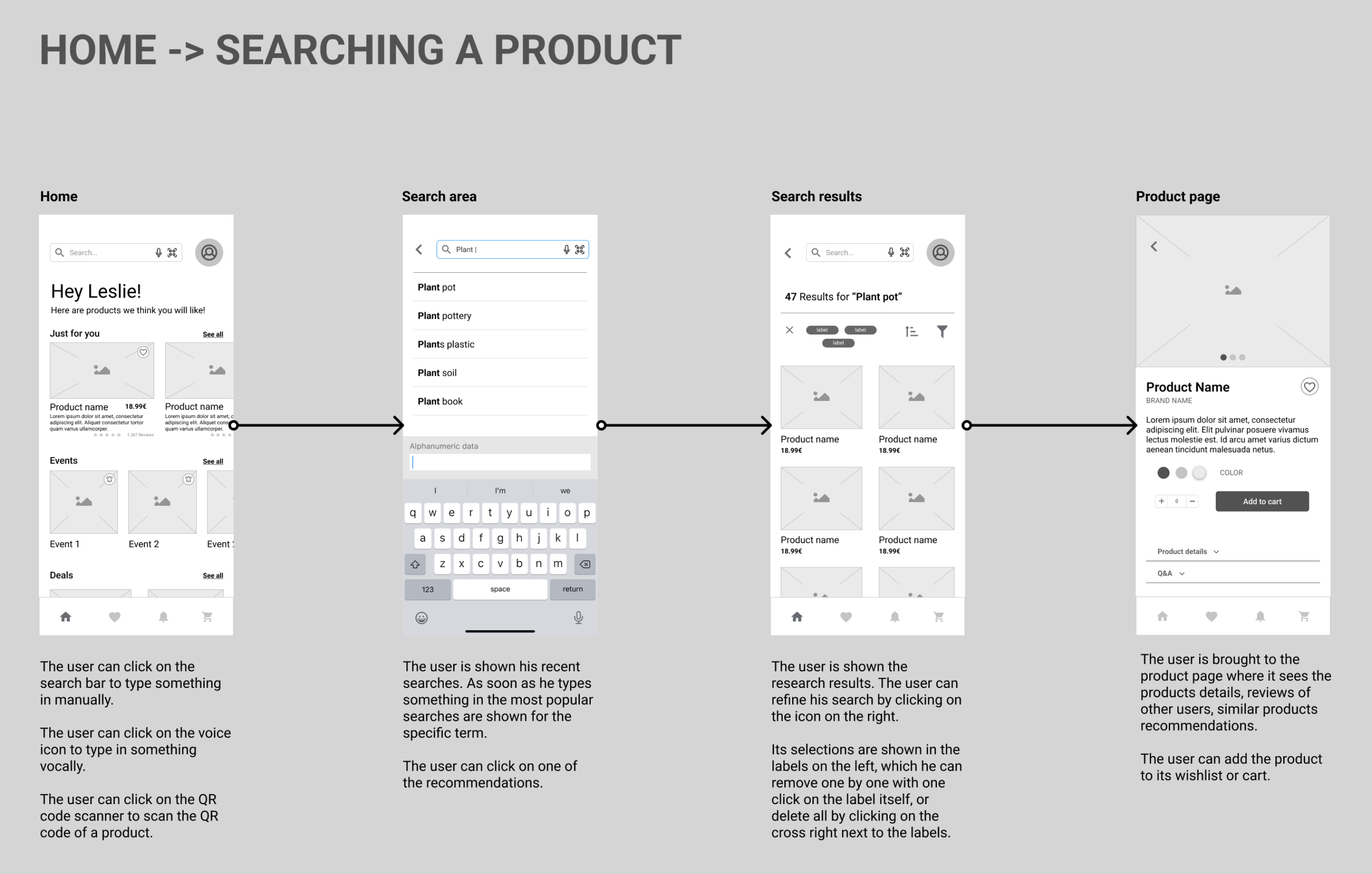
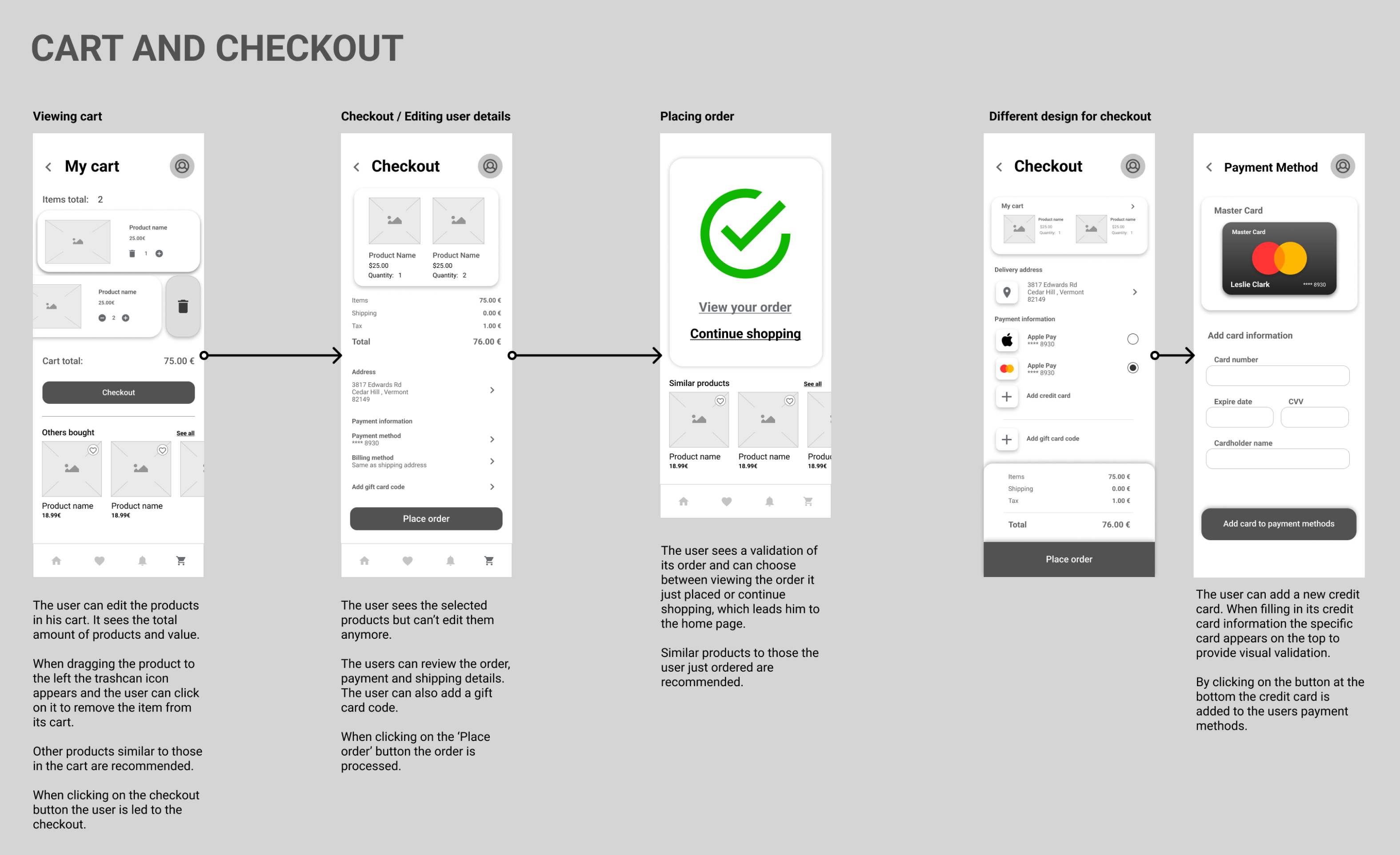
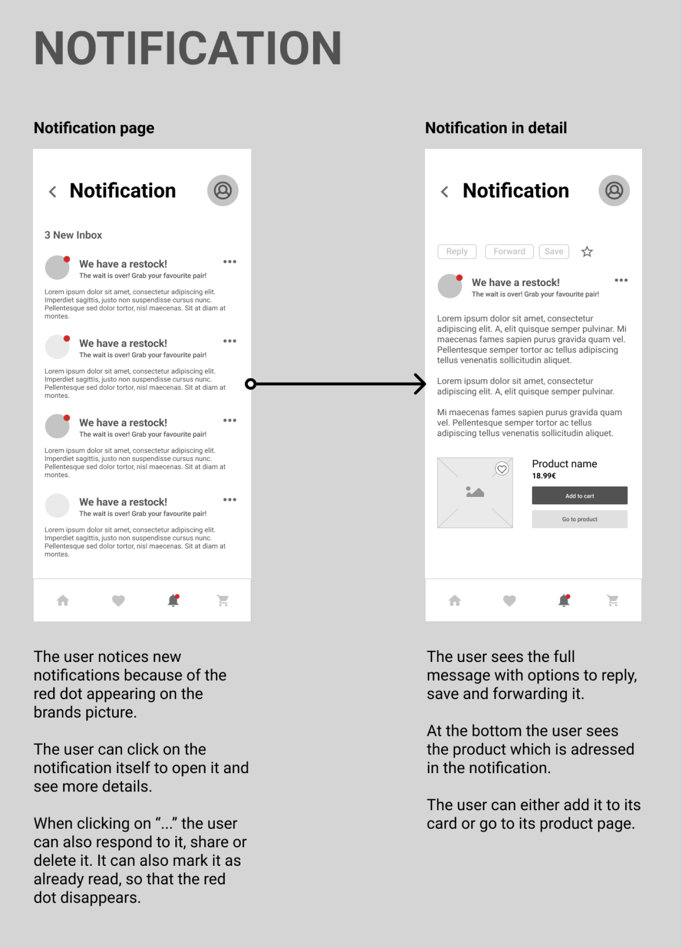
Wireframes
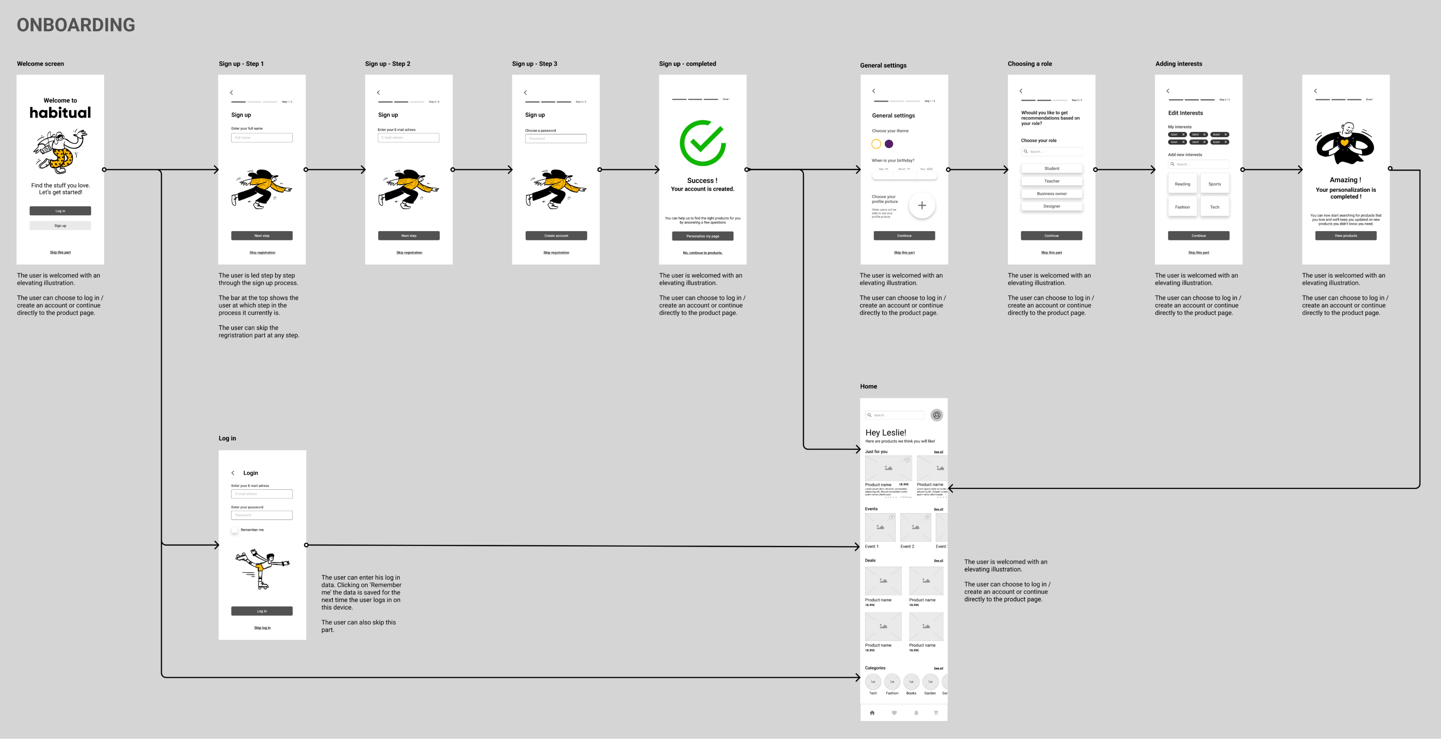
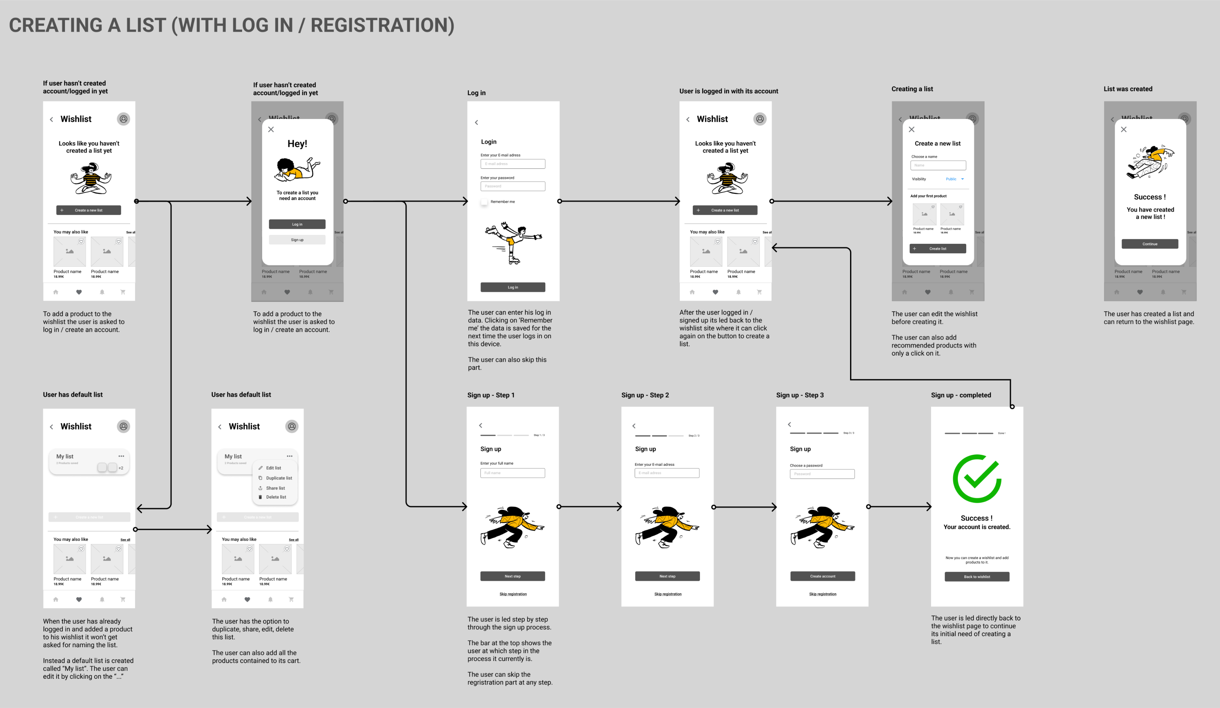
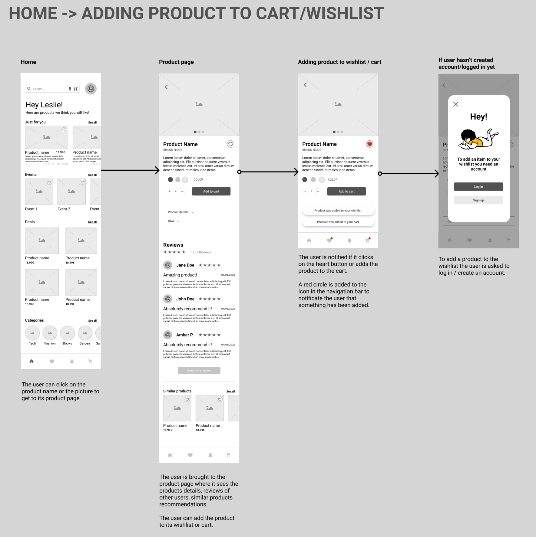
From there I started to design low-fidelity wireframes in Figma.
Style Guide
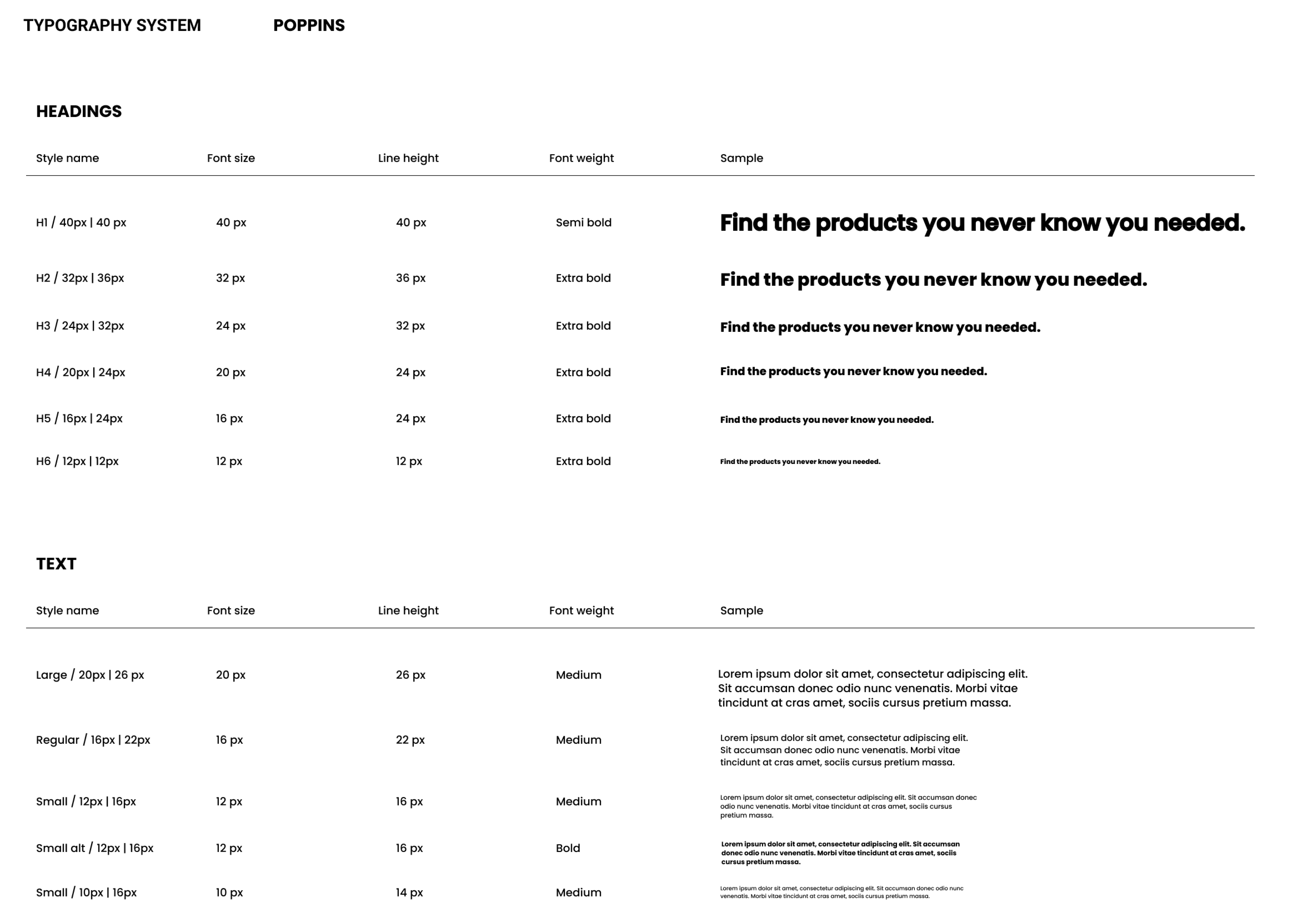
Another painpoint is the blant UI of Amazon’s webpage. Because Max and Lindsay are young people I decided to give the app a clean and light design with modern typography and a small color variation to prevent the page from feeling overloaded and more appealing with rounded shapes. I turned every element into components in Figma to build a flexible prototype.
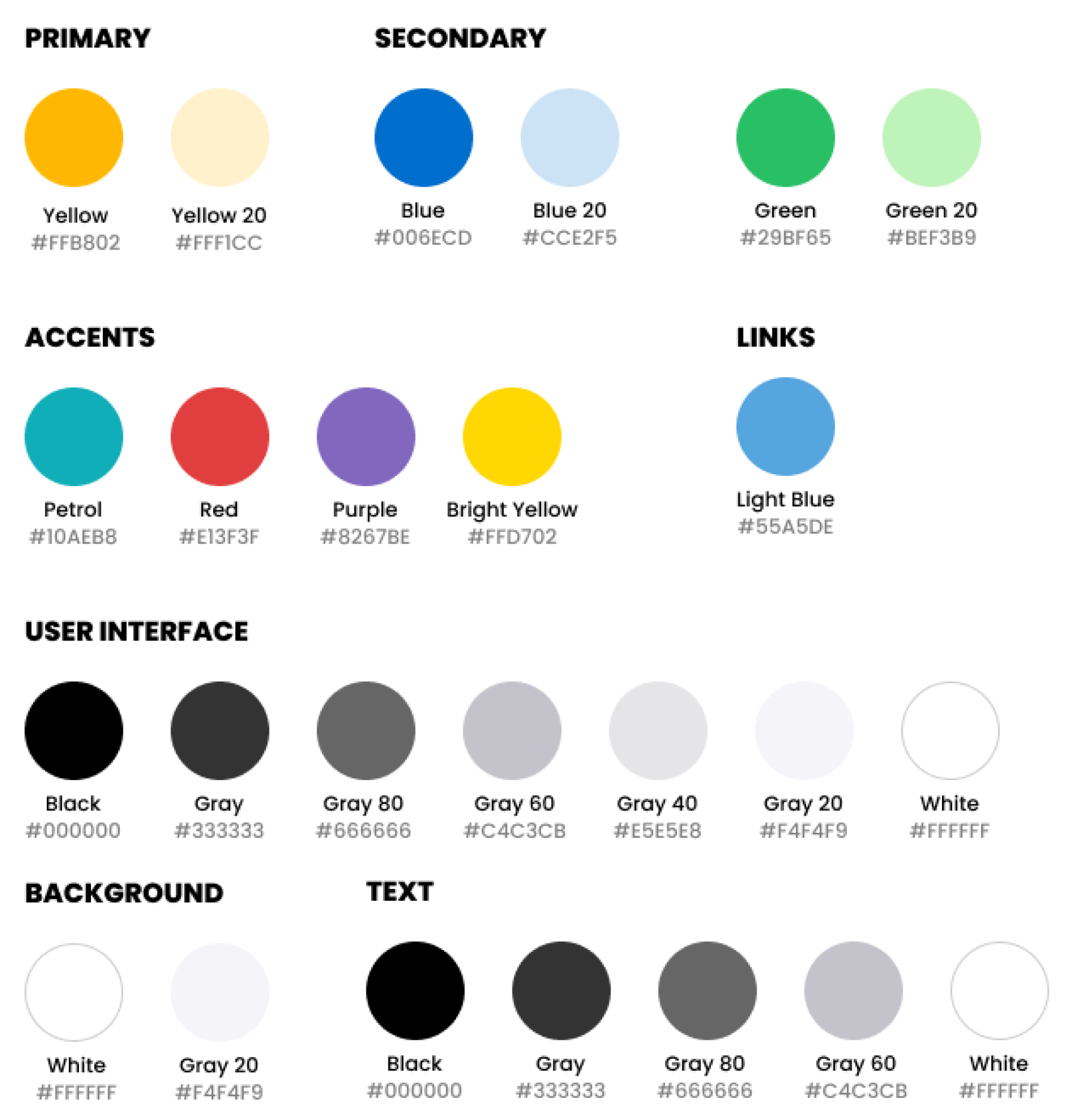
Typography
Color palette
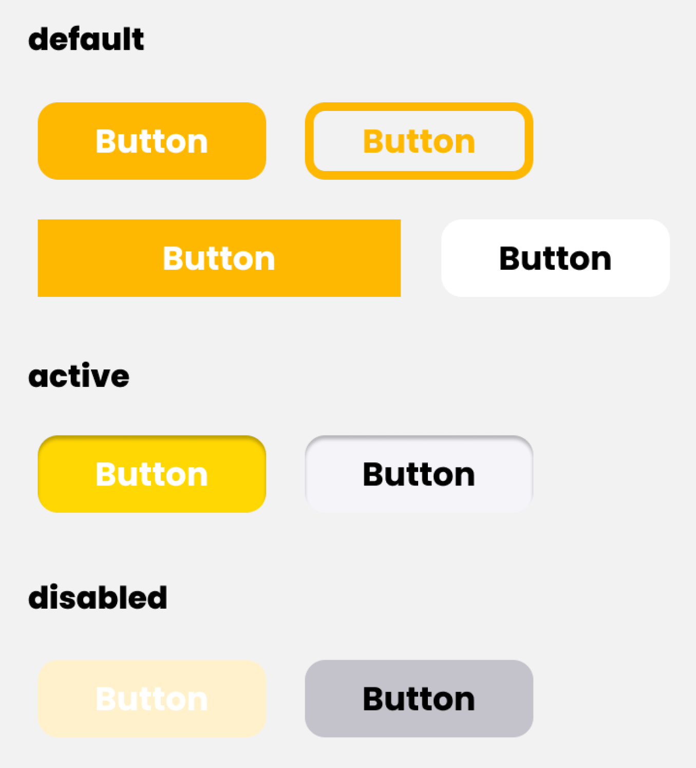
Buttons
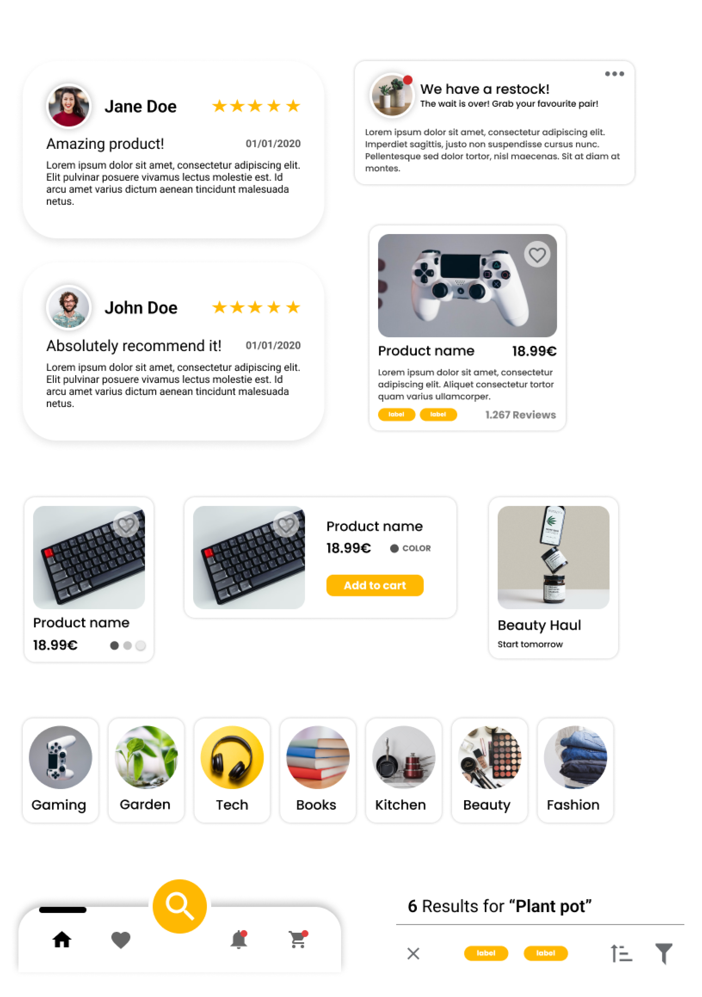
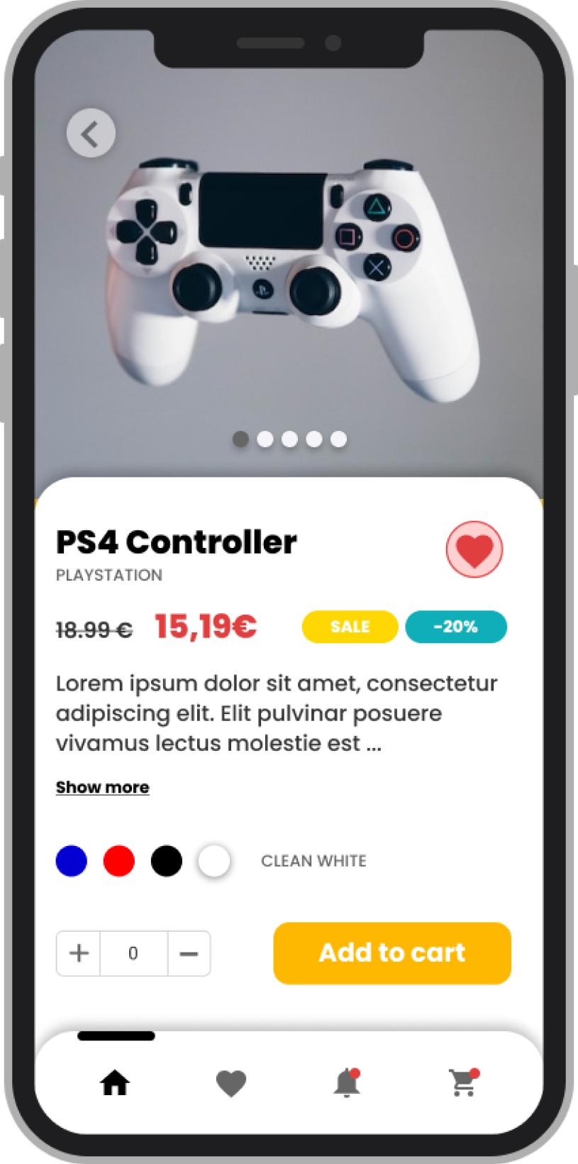
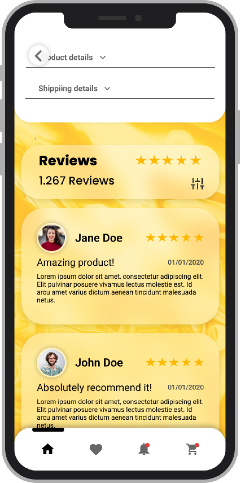
Cards/Products
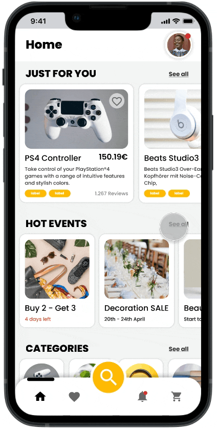
Second Iteration
-> Take away:
- Background still distracting
- Search bar isn’t reachable/accessable enough and therefore isn’t as striking as intended
- Panels should be subdivided in cards to make every product look distinct and on it’s own instead of a big cluster
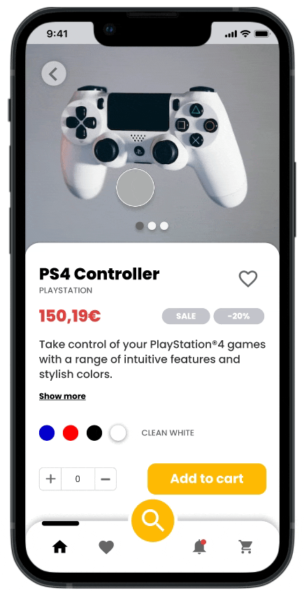
-> Corrections:
- Removing the background image and replacing it by a light grey blueish solid color
- Search bar becomes an icon and is placed in the nav bar at the bottom. To strike enough attention the icon gets a contrasting color
- Every panel gets its own space/border so it gets a card-like appearance
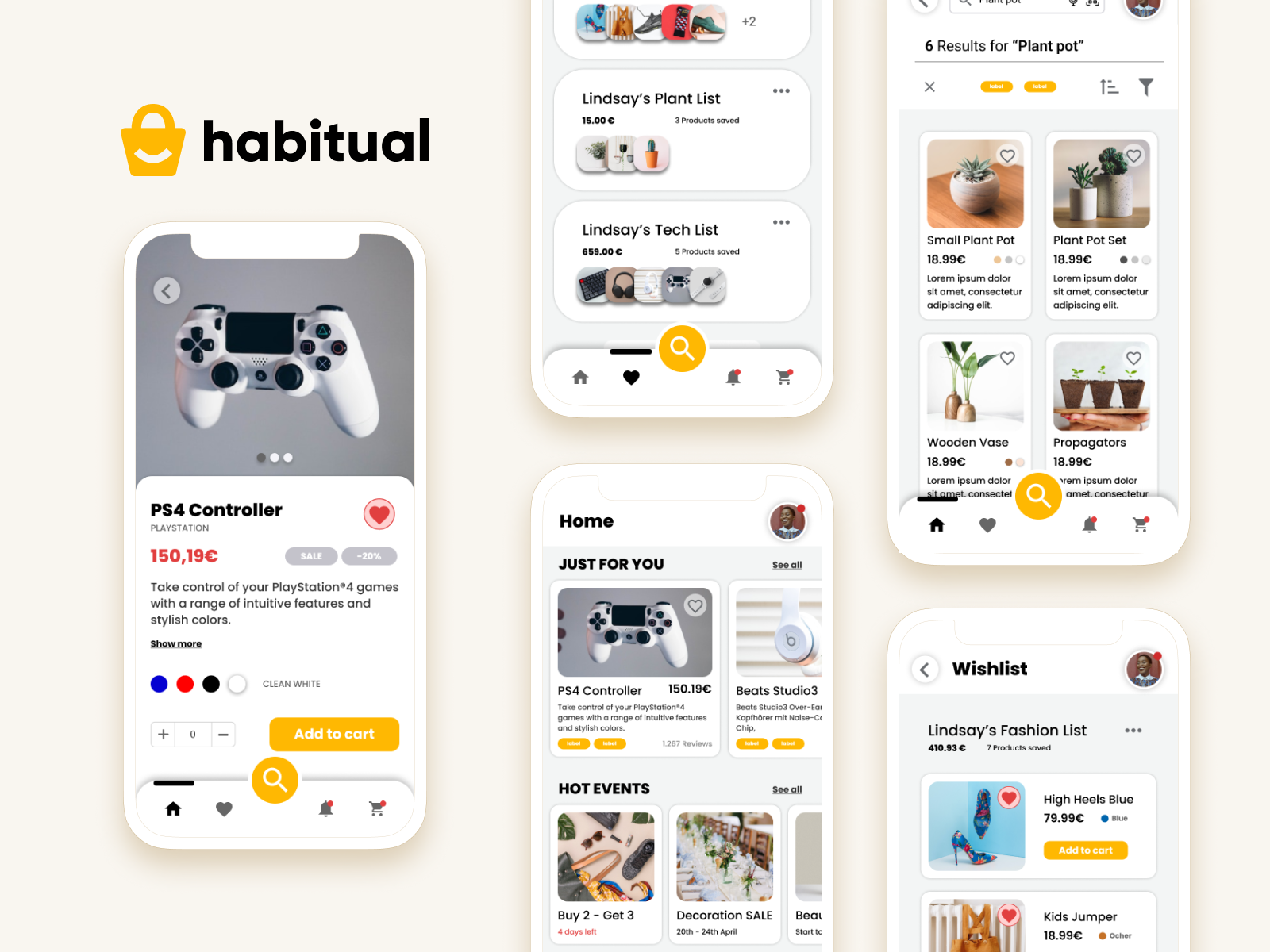
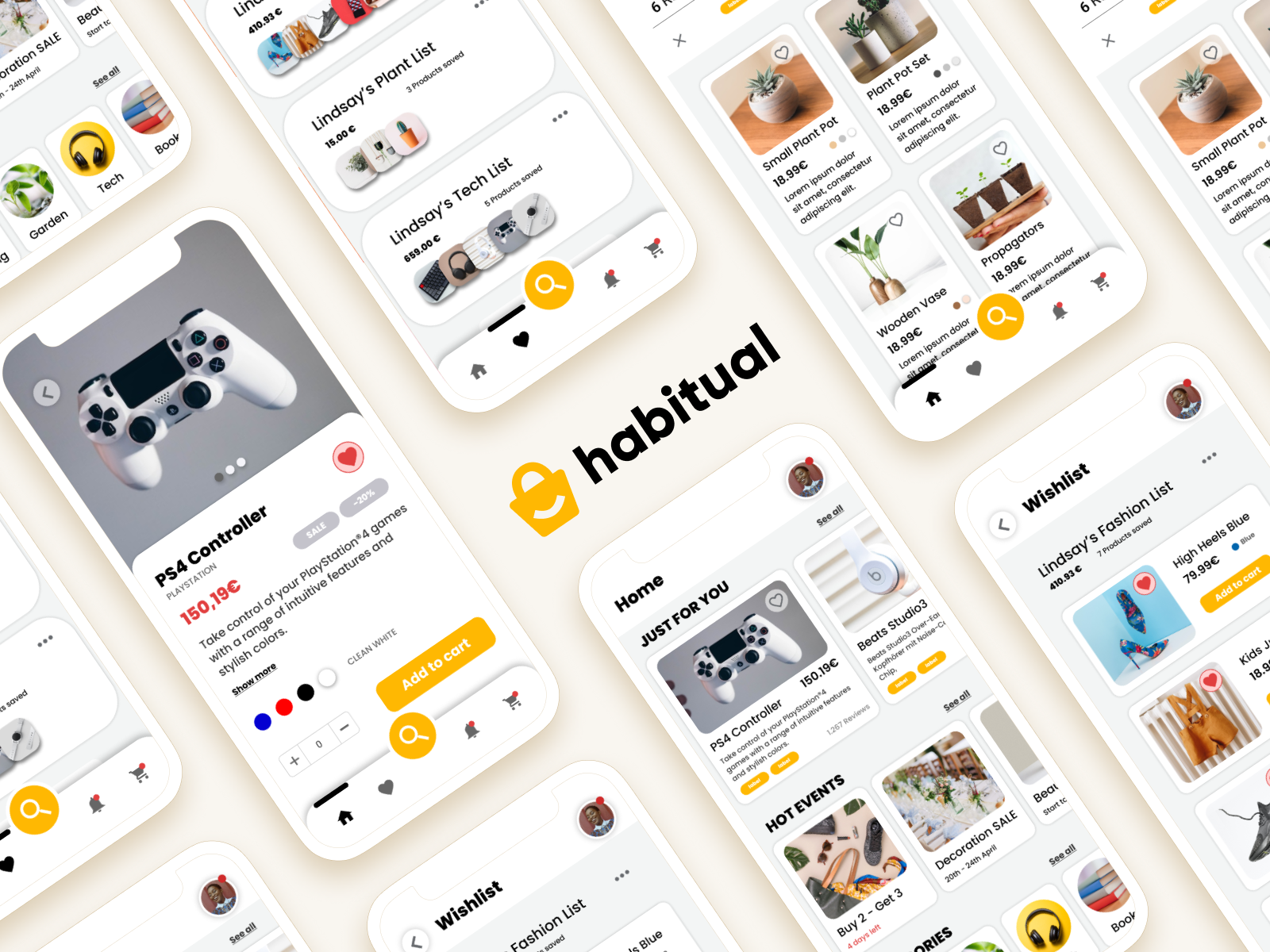
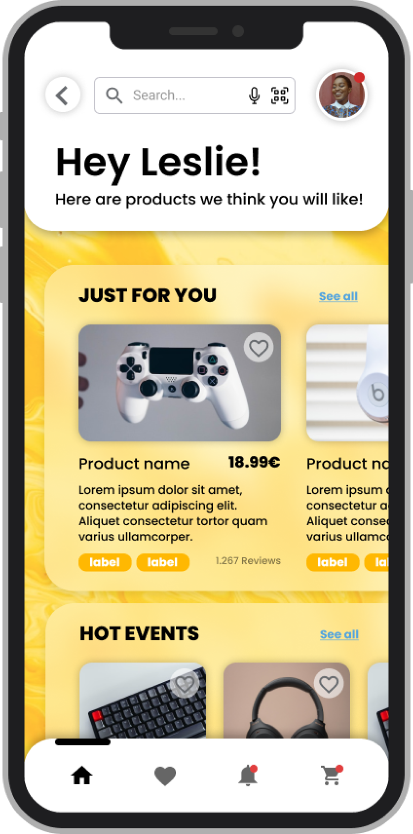
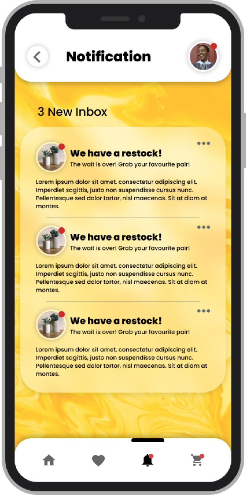
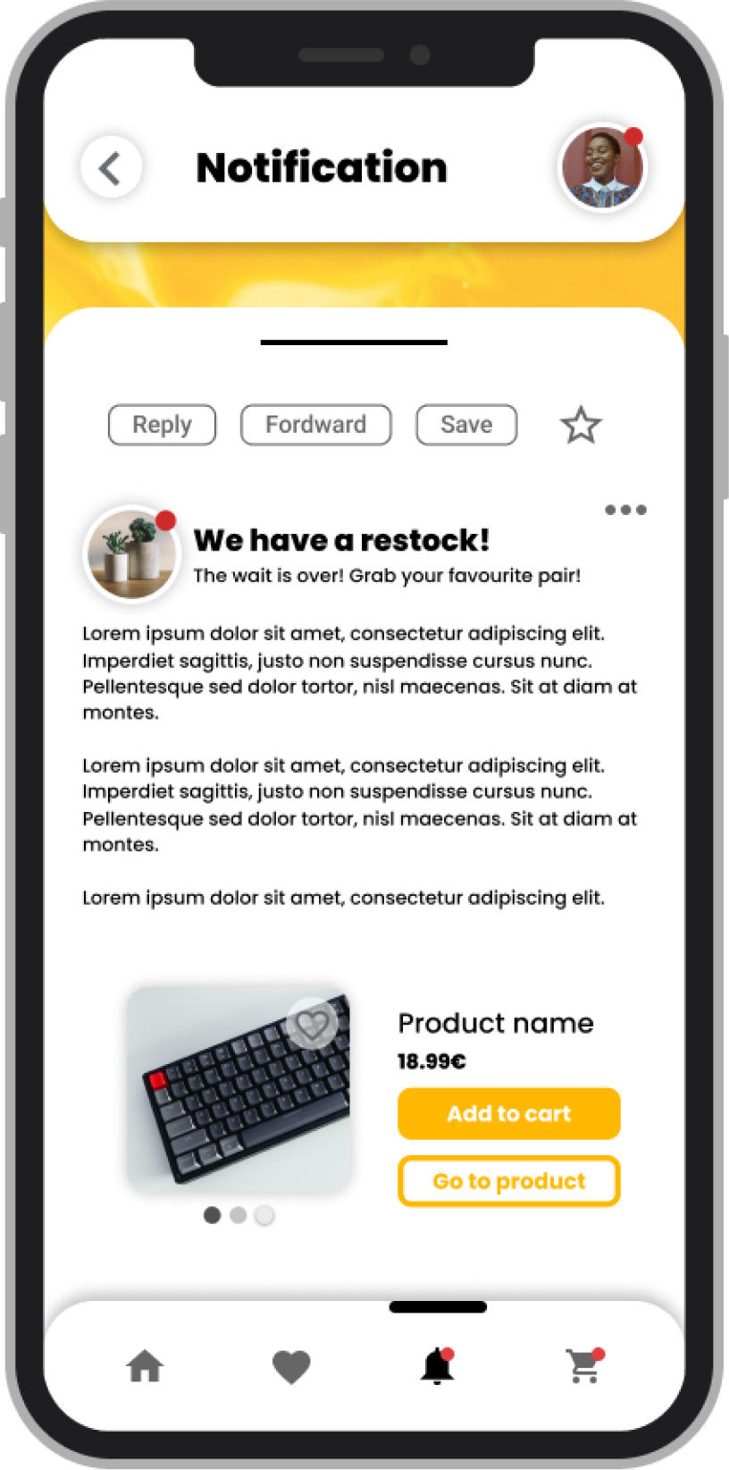
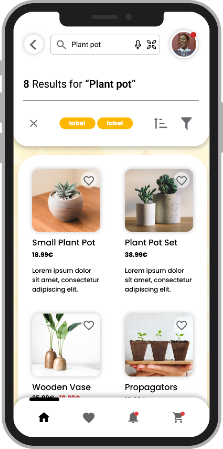
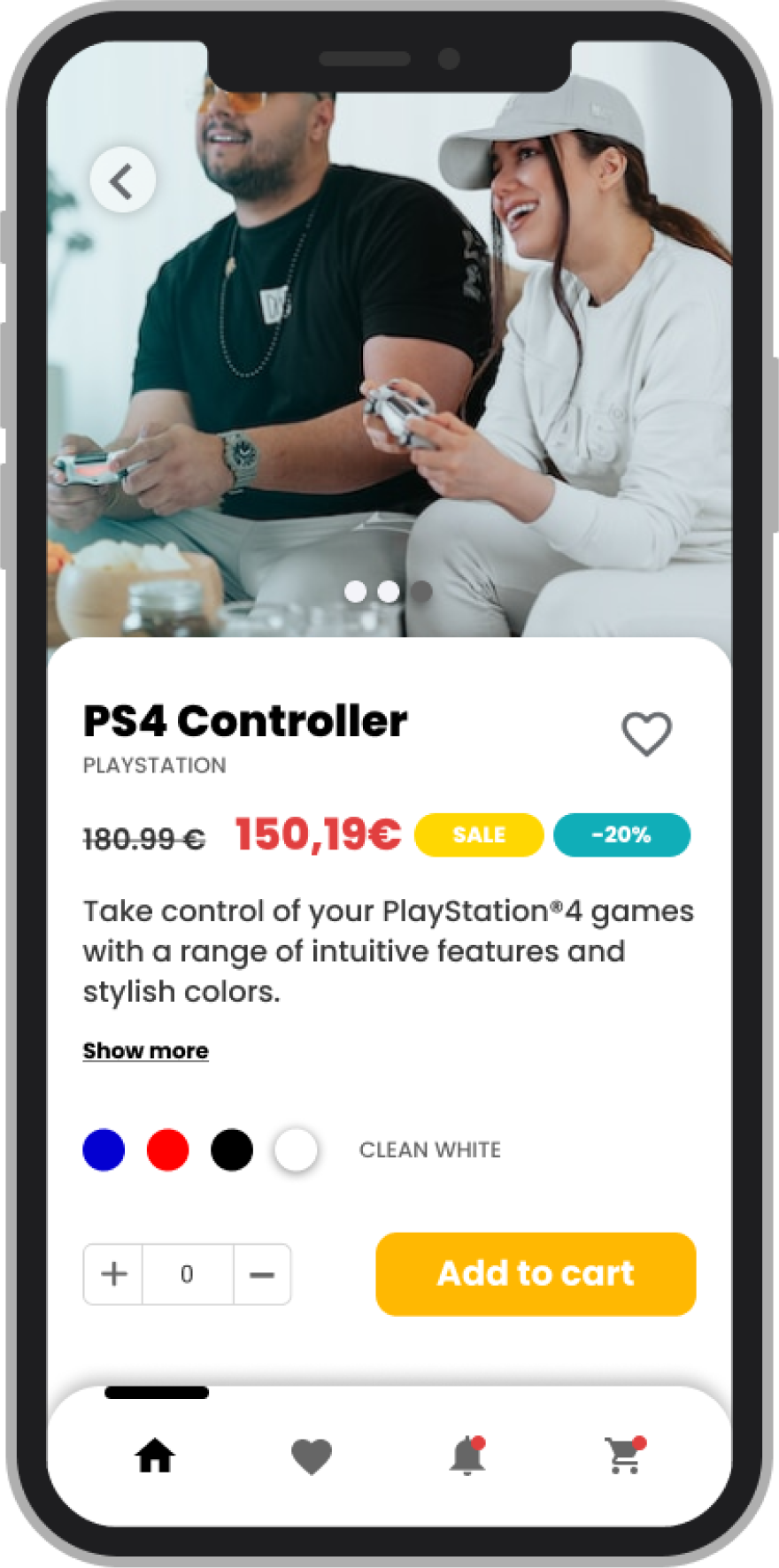
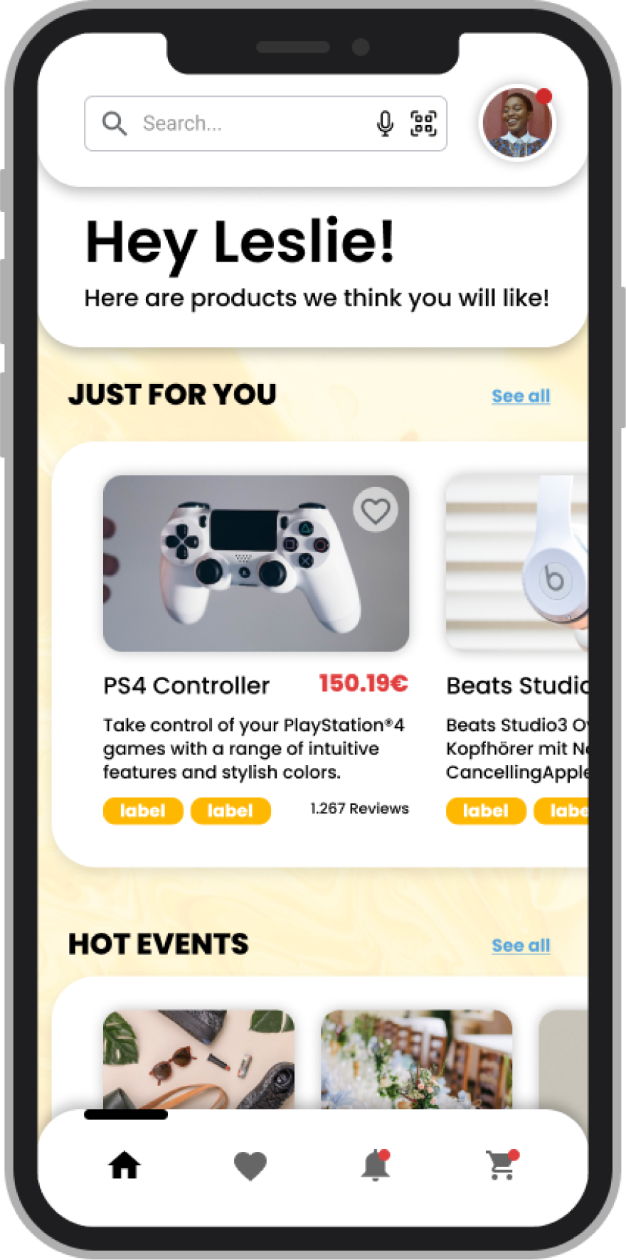
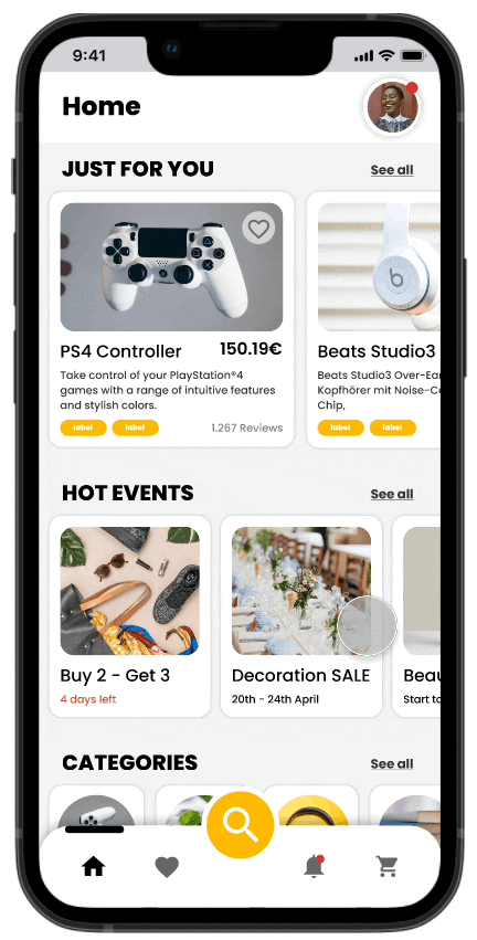
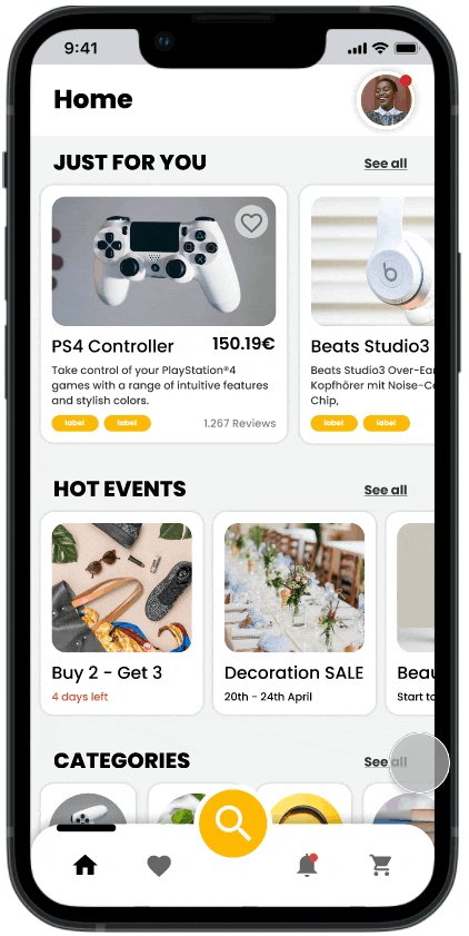
Third Iteration (Final)

Learnings
As this was my first UX/UI project I’ve learned a lot about design thinking and how to go through every ideation step. I worked myself into Figma and Miro as design tools and had to take a lot of research on many different topics. It was challenging at first, but the more hours I spent on this project the more intuitive it felt to think of new features and designs as well viewing the product from the users position.
Future additions
From my research and brainstorming I have many more features that might be worked and tested on.
- Membership Area
- Habitual Points (App currency) / Gamification
- Light/Dark mode
- Testing filter feature for searching results
- Creating a wishlist
- Writing reviews
- Chatbot